
Creating a Scatter Plot in Excel is the most effective way to find a relationship between two sets of data— like “Study Hours vs. Exam Scores” or “Advertising Spend vs. Sales”.
A standard bar chart simply won’t cut it. Scatter plots are the backbone of data analysis, allowing you to visualize correlations and patterns that would be invisible in a simple table. Furthermore, by adding a Trendline, you can forecast future results and perform regression analysis in seconds.
In this comprehensive guide, you will learn how to build a professional Scatter Plot in Excel, customize it for presentations, and interpret the results correctly.
What is a Scatter Plot in Excel and When Should You Use It?
Before diving into the clicks, it is important to understand the why. A Scatter Plot displays values for typically two variables for a set of data.
- The X-Axis (Horizontal): Usually represents the independent variable (the cause).
- The Y-Axis (Vertical): Represents the dependent variable (the effect).
Use a Scatter Plot when:
- You want to see if one variable affects another (Correlation).
- You have many data points and want to see the distribution.
- You need to identify outliers (data points that don’t fit the pattern).
Step-by-Step: Creating Your First Scatter Plot in Excel
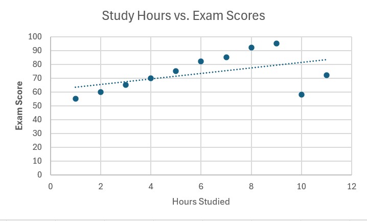
Let’s create a graph to analyze if studying more hours actually leads to better grades.
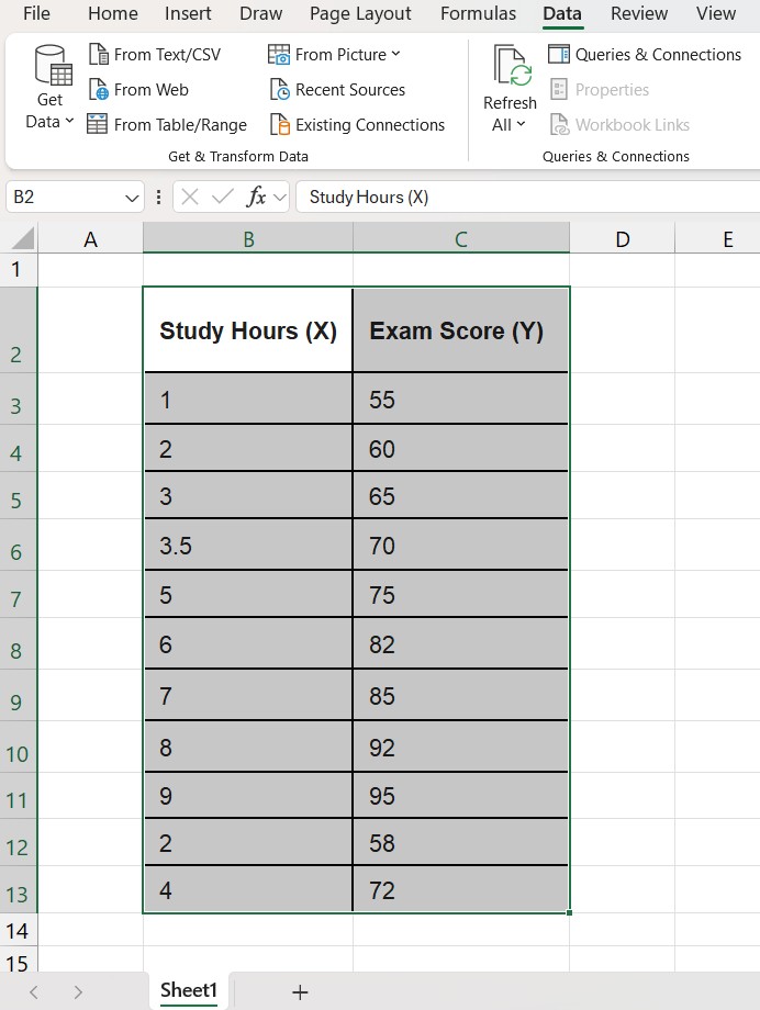
Step 1: Prepare Your Data Correctly
This is where most beginners fail. For a Scatter Plot to work, your data must be arranged in two columns with numeric values.
- Left Column: X-Axis values (e.g., Study Hours).
- Right Column: Y-Axis values (e.g., Test Score).
Note: Do not include text in these columns, only numbers.
Step 2: Select Your Data Range
Highlight the two columns containing your data, including the headers (titles).
- Shortcut: Click inside your table and press Ctrl + A.
Step 3: Insert the Chart
- Go to the Insert tab on the top ribbon.
- Look for the “Charts” group.
- Click on the icon that looks like a graph with dots (Insert Scatter (X, Y) or Bubble Chart).
- Select the first option: Scatter.
Excel will instantly generate a basic chart with dots representing your data points.
How to Customize Your Scatter Plot in Excel
A raw Excel chart looks unprofessional. Let’s clean it up to make it report-ready.
1. Add Axis Titles (Crucial)
Without labels, nobody knows what “10” or “100” means.
- Click on the chart.
- Click the green (+) plus sign that appears to the top right of the chart.
- Check the box for Axis Titles.
- Double-click the new text boxes to rename them (e.g., “Hours Studied” and “Exam Score”).
2. Adjust the Scale
If your scores range from 50 to 100, but the graph starts at 0, you will have a lot of empty white space.
- Right-click on the vertical numbers (Y-Axis).
- Select Format Axis.
- In the sidebar, under “Bounds”, change the Minimum from 0 to 50 (or whatever fits your data). This “zooms in” on your data.
Advanced: Adding a Trendline (Regression Line)
This is the feature that transforms a drawing into an analytical tool. A trendline is a straight line that best represents the data on a scatter plot.
How to add it:
- Click on the chart again.
- Click the (+) button.
- Check the box for Trendline. Excel will draw a line through the center of your dots.
Displaying the Equation (R-Squared): To see the math behind the line:
- Right-click on the trendline itself.
- Select Format Trendline.
- Scroll down in the sidebar and check two boxes:
- Display Equation on chart
- Display R-squared value on chart
What does R-Squared mean?
The R² value is a number between 0 and 1.
- Near 1 (e.g., 0.95): Extremely strong correlation. The X variable strongly predicts the Y variable.
- Near 0 (e.g., 0.10): No correlation. The variables are not related.
Common Mistakes to Avoid
- Swapping Axes: Remember, Excel generally puts the left column on the X-axis and the right column on the Y-axis. If your chart looks wrong, check your column order.
- Using a Line Chart instead of Scatter: A Line Chart connects dots based on category order, not numeric value. Always choose the “Scatter” icon (dots without connecting lines) initially.
- Ignoring Outliers: If one dot is far away from the trendline, investigate it. It could be a data entry error or a significant anomaly.
Frequently Asked Questions (FAQ)
Can I use text on the X-Axis for a Scatter Plot in Excel? No. Scatter plots require numeric data on both axes. If you have text categories (like “January, February, March”), you should use a Line Chart or Bar Chart instead.
How do I make the dots bigger or change color? Right-click on any of the blue dots in your chart, select Format Data Series, and go to the “Marker” options (paint bucket icon). Here you can change the size, color, and shape of your data points.
Can I add multiple data sets to one Scatter Plot in Excel? Yes. Right-click on the chart, choose Select Data, and click Add to include a second series of X and Y values (e.g., “Class A” vs “Class B”).
Want to go deeper into data analysis? Now that you have visualized your data, you might want to calculate the exact variation. Check out our guide on How to Calculate Standard Deviation in Excel.
Pingback: XLOOKUP vs. VLOOKUP: Why It Is Time to Switch (2025 Comparison) – ExcelifyHub
Pingback: How to Create a Pivot Table in Excel: The Ultimate Beginner’s Guide – ExcelifyHub
Pingback: How to Lock Cells in Excel: Step-by-Step Guide (2025)