
Imagine you have a massive spreadsheet with 10,000 rows of sales data. Your boss asks you: “How much did we sell in the North region last month?” or “Who is our top-performing salesperson?”
If you start manually filtering columns or writing complex SUMIF formulas, you are doing it the hard way. You need a Pivot Table.
A Pivot Table is widely considered the most powerful feature in Microsoft Excel. It allows you to summarize, analyze, explore, and present summary data in just a few clicks—without writing a single formula. It turns a wall of numbers into a clear, concise report.
In this comprehensive guide, we will walk you through exactly how to create your first Pivot Table, how to customize it, and how to avoid the common mistakes that beginners make.
What is a Pivot Table?
Simply put, a Pivot Table takes a “flat” detailed dataset and “pivots” (rotates) it to look at the data from a different perspective. It aggregates the values based on the categories you select.
Why should you use it?
- Speed: You can summarize thousands of rows in under 10 seconds.
- Flexibility: You can drag and drop fields to completely change the report structure instantly.
- Accuracy: Since Excel does the math for you, you eliminate human error from manual calculations.
Step 1: Prepare Your Data (Crucial)
Before you insert a Pivot Table, your source data must be “clean”. If it isn’t, the Pivot Table won’t work correctly.
The 3 Rules of Clean Data:
- Headers: Every single column must have a unique title in the first row (e.g., Date, Region, Sales).
- No Empty Rows: Ensure there are no completely blank rows or columns inside your dataset.
- Consistent Data Types: Don’t mix text and numbers in the same column (e.g., a “Sales” column should only contain currency numbers, not text like “USD”).
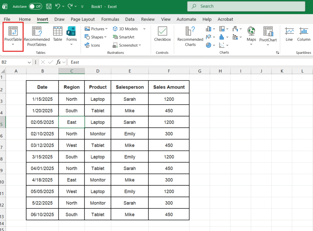
Step 2: Insert the Pivot Table
Once your data is ready, creating the table is easy:
- Click anywhere inside your dataset table.
- Go to the Insert tab on the top ribbon menu.
- Click the very first button on the left: PivotTable.
- A pop-up window named “Create PivotTable” will appear.
- Table/Range: Excel usually detects your data automatically (you will see “marching ants” around your table).
- Choose where to place it: We recommend selecting New Worksheet. This keeps your original data safe and your report clean on a separate tab.
- Click OK.
Step 3: Understanding the Interface
You will now see a blank placeholder on the left and a panel called PivotTable Fields on the right. This panel is your control center.
The 4 Key Areas:
- ROWS: The items you drag here will appear as row labels on the left side of your table. (e.g., Product Name).
- COLUMNS: Items here will become column headers across the top. This is useful for splitting data by year or region.
- VALUES: This is where the math happens. Drag numeric fields here (e.g., Sales Amount). Excel will automatically SUM or COUNT them.
- FILTERS: This allows you to restrict the entire report to a specific criteria (e.g., Show data only for Sarah).
Step 4: Building Your First Report (Example)
Let’s say we want to answer the question: “What is the total sales amount for each Region?”
- Find “Region” in your field list and drag it down to the ROWS area.
- Result: You will see North, South, East, and West listed on the sheet.
- Find “Sales Amount” and drag it to the VALUES area.
- Result: Excel instantly sums up all sales for each region next to their names.
It really is that simple. You just built a summary report in two drags.

Step 5: Formatting the Numbers
By default, Excel Pivot Tables display numbers as plain text (e.g., 4500), which can be hard to read. Let’s make them look like currency.
The Wrong Way: Do not highlight the cells and use the Home tab formatting. If you change the Pivot Table layout later, you might lose the formatting.
The Right Way:
- Right-click on any number inside the Pivot Table.
- Select Number Format (not “Format Cells”).
- Choose Currency or Accounting.
- Select your symbol ($ or €) and decimal places.
- Click OK.
Now, no matter how much you change the table, the numbers will always remain formatted as money.

Advanced: Grouping by Dates
This is a “pro” feature that is actually automatic in modern Excel. If you drag the “Date” field into the ROWS area, Excel will automatically group your daily sales into Months, Quarters, and Years.
If you want to see the specific dates again, you can expand the groups by clicking the small (+) signs next to the Month names.
Frequently Asked Questions (FAQ)
My Pivot Table isn’t updating when I add new data. Unlike formulas, Pivot Tables do not update live. If you add new rows to your original dataset, you must tell the Pivot Table to check again. Right-click anywhere on the Pivot Table and select Refresh (or press Alt + F5).
How do I show Averages instead of Sums? If you want to know the average sale price instead of the total: Right-click any number in the Pivot Table > Summarize Values By > Average.
Can I make charts from this? Yes! Click on your Pivot Table and go to the “PivotTable Analyze” tab -> PivotChart. This will create a dynamic chart that updates as you change the table.
Ready for more analysis? Pivot Tables are great for finding patterns. If you want to visualize these patterns with a trendline, check out our guide on How to Create a Scatter Plot in Excel.
Pingback: How to Create a Gantt Chart in Excel from Scratch (Step-by-Step Guide 2025) – ExcelifyHub
Pingback: The Ultimate Excel Keyboard Shortcuts Guide: 50+ Keys to Save Hours – ExcelifyHub