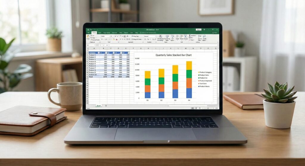
Every project manager knows the struggle. You need to present a timeline to your boss or client. You check specialized software like Microsoft Project or Monday.com, but they are expensive and complicated.
You think: “Can I just do this in Excel?”
The answer is yes, but there is a catch. Excel does not have a built-in “Gantt Chart” button. If you search the charts menu, you won’t find it.
However, with a clever trick using Stacked Bar Charts, you can build a dynamic, professional Gantt Chart in under 5 minutes.
In this guide, we will show you the secret method to visualize your project schedule without buying expensive templates.
What is a Gantt Chart?
A Gantt Chart is a bar chart that illustrates a project schedule. It shows tasks on the vertical axis and time intervals on the horizontal axis. The width of the horizontal bars shows the duration of each task.
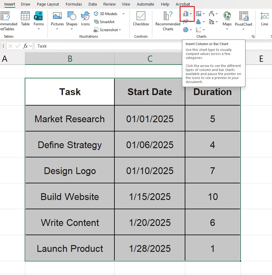
Step 1: Structure Your Data Properly
The success of this chart depends entirely on how you set up your table. Excel needs three specific columns:
- Task Name: What needs to be done.
- Start Date: When the task begins.
- Duration: How many days the task takes.

Warning: Do not use an “End Date” column for the chart. If you have end dates, calculate the Duration using a formula (=End_Date - Start_Date). Excel needs the Duration number to draw the bars correctly.
Step 2: Insert a Stacked Bar Chart
This is the “secret sauce”. We aren’t going to look for a Gantt chart; we are going to use a Stacked Bar.
- Select your data range (including headers).
- Go to Insert > Insert Column or Bar Chart.
3. Under the “2-D Bar” section, select Stacked Bar.
- Note: It is crucial to choose “Stacked Bar” (the second icon), not “Clustered Bar”.
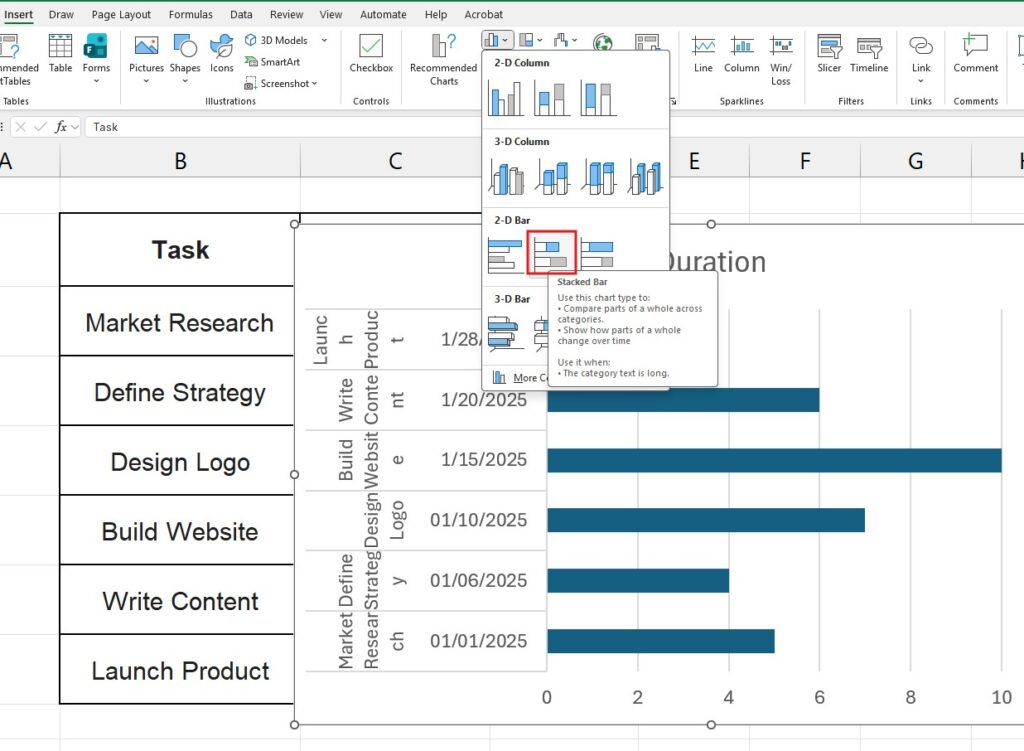
At this point, the chart will look weird. You will see blue bars (Start Dates) and orange bars (Duration). Don’t panic, this is part of the process.
Step 3: The “Invisibility” Trick
To make it look like a Gantt chart, we need to hide the first set of bars (the Start Dates) so that the second set (Duration) looks like it’s “floating” in the timeline.
- Click specifically on the blue bars (the Start Date series) inside the chart.
- Right-click and select Format Data Series.
- Go to the Fill & Line bucket icon.
- Select No Fill.
Suddenly, your chart transforms. The blue bars disappear, leaving only the “floating” duration bars visible. It is starting to look like a real timeline!
Step 4: Reverse the Task Order
You might notice a problem: Excel lists your tasks in reverse order (bottom to top). Let’s fix that.
- Click on the list of Task Names (the vertical axis on the left).
- Right-click and choose Format Axis.
- In the Axis Options sidebar, check the box that says Categories in reverse order.
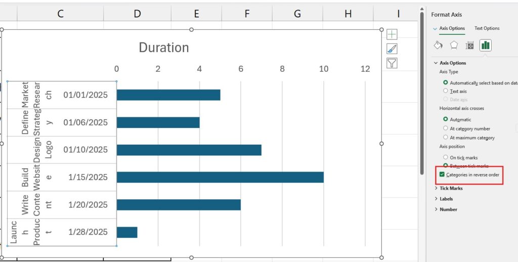
Now your tasks are listed chronologically from top to bottom, and the dates have moved to the top of the chart. Perfect.
Step 5: Clean Up the Dates (The Finishing Touch)
Often, the chart starts weeks before your first task, leaving a huge empty space on the left.
- Find your first Start Date in your data table (e.g., 1/1/2025).
- Copy that date and paste it into an empty cell.
- Change the format of that cell to “General” or “Number”. You will see a number like
45658. This is Excel’s internal code for that date. - Now, Right-click the Date Axis (top of the chart) and select Format Axis.
- Under “Bounds”, change the Minimum to that number (e.g., 45658).
This zooms the chart in so it starts exactly on your project’s first day.
Customizing Your Gantt Chart
Now that the structure is built, you can style it:
- Change Colors: Click the bars and use the Fill tool to make them your brand color.
- Add Labels: Right-click the bars -> Add Data Labels to show the number of days on the bars.
- 3D Effects: You can add a shadow effect in “Format Data Series” to make the bars pop.
Frequently Asked Questions (FAQ)
Can I exclude weekends from the duration? Yes, but you need to adjust your data table, not the chart. Use the =NETWORKDAYS() function in Excel to calculate duration excluding weekends and holidays.
Can I add dependencies (Task B starts after Task A)? To do this dynamically, use a formula for the “Start Date” of Task B. Set Task B’s start date equal to Task A’s Start Date + Task A’s Duration. If Task A gets delayed, Task B will move automatically on the chart.
Analyze your project data Once your project is finished, you might want to analyze performance. Learn how to summarize your project data effectively with our guide on How to Create a Pivot Table in Excel.