
Rows and columns of numbers are great for storage, but terrible for presentations. If you want to spot trends, compare sales instantly, or impress your boss during a meeting, you need to learn how to create charts in Excel.
Visualizing data helps you tell a story. Whether you need a simple Bar Graph, a complex Combo Chart, or mini-charts inside a cell, Excel makes it incredibly easy—if you know which buttons to press.
Here is your complete step-by-step guide to turning boring data into beautiful visualizations.
Step 1: Prepare Your Data Correctly
Before learning how to create charts in Excel, your data needs to be clean and organized.
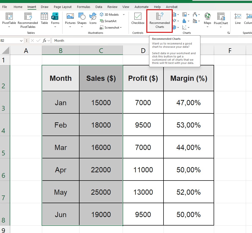
- Headers: Ensure your first row has clear labels (e.g., “Month”, “Sales”, “Profit”).
- No Empty Rows: Remove blank rows within your dataset to avoid awkward gaps in the line or bars.
- Use Tables (Pro Tip): If you select your data and press
Ctrl + Tto turn it into an official Excel Table, your chart will automatically update when you add new data next month.
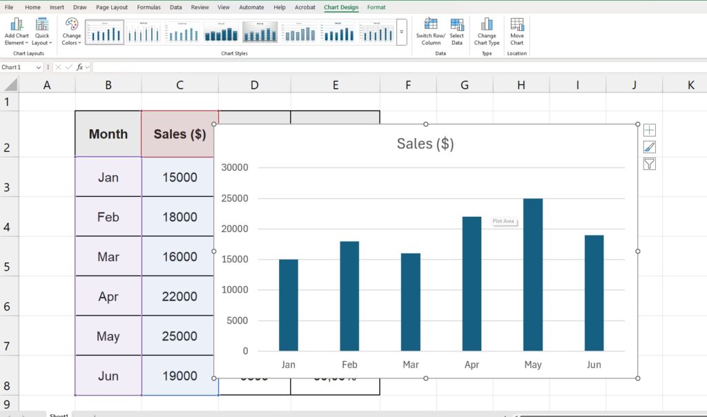
Step 2: The “Recommended Charts” Method (Easiest)
Excel is smart. It can analyze your data and guess exactly what kind of chart you need. This feature is perfect for beginners who are just learning how to create charts in Excel and aren’t sure which type to pick.
- Select your data: Click and drag to highlight the cells (including headers).
- Go to the Insert tab on the Ribbon.
- Click on Recommended Charts.
- Excel will show you a preview of Bar charts, Line charts, or Pie charts. Pick the one you like and click OK.
Boom. You have a professional chart instantly.
Step 3: The “Alt + F1” Shortcut (Fastest)
Want to look like a wizard? You can create a chart in less than 1 second without touching your mouse.
- Click anywhere inside your data table.
- Press
Alt + F1on your keyboard (orOption + F1on Mac).
Excel will instantly insert a default Clustered Column Chart right next to your data. It is the fastest way to learn how to create charts in Excel when you are in a hurry.
Step 4: My Chart Looks Wrong! (Switch Row/Column)
Sometimes, Excel gets confused. You wanted “Months” on the bottom axis, but Excel put the “Products” there instead. Don’t delete the chart! Knowing how to fix axis issues is just as important as knowing how to create charts in Excel.
- Click on your chart to select it.
- Go to the Chart Design tab at the top.
- Click the button that says Switch Row/Column.
This instantly flips the X and Y axes. It is the number one fix for weird-looking charts.
Step 5: How to Create Combo Charts (Secondary Axis)
Many users ask how to create charts in Excel that can plot two different types of data, like “Total Revenue” (Bars) and “Profit Margin %” (Line), on the same graph. If you put them together normally, the percentage line will be flat on the bottom because 20% (0.20) is tiny compared to $10,000.
You need a Combo Chart:
- Select your data (Sales and Percentage).
- Go to Insert > Recommended Charts.
- Click on the All Charts tab and select Combo at the bottom.
- Check the box for Secondary Axis next to your Percentage data line.
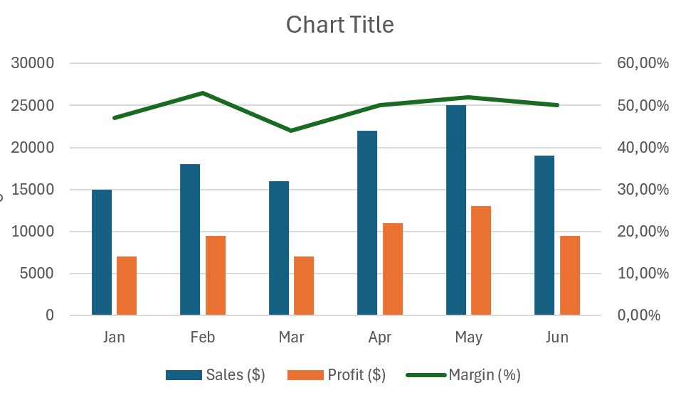
Now you have bars for the money (Left Axis) and a line for the percentage (Right Axis). This is a professional-grade visualization.
Step 6: Sparklines (Mini Charts in Cells)
Part of mastering how to create charts in Excel is knowing when to use mini-charts called Sparklines.
- Select the empty cell next to a row of data.
- Go to Insert > Sparklines (choose Line or Column).
- Select the data range you want to visualize (e.g., Jan to Dec sales).
- Click OK.
Now you have a tiny line chart inside the cell. It’s perfect for dashboards with limited space.
Step 7: Customizing for a Professional Look
A default chart is good, but a customized one is better.
- Remove Gridlines: Click the horizontal lines in the background of the chart and press
Delete. This makes the data stand out. - Add Trendlines: Right-click on any data bar or line and select “Add Trendline” to show the growth direction.
- Change Colors: Use the Chart Design tab to match your company branding.
Conclusion
Learning how to create charts in Excel transforms you from a data entry clerk into a data analyst. It brings your numbers to life and makes your reports impossible to ignore.
Now that you have mastered charts, why not learn how to organize your data better? Check out our guide on How to Create a Pivot Table in Excel to summarize your data before charting it.